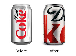
I love this can and I
don’t know why.
It’s bold meets absolute simplicity. A testament to the no.
3 soft drink’s clout, it’s amazing how instantly recognizable it is.
Less is more. It’s confident and clever.
Never mind surreptitious waves, swirls of silver and fake
water droplets, the new treatment is fully prepared to elevate the DC logo to
icon status.
Re-gifted?
A Turner Duckworth design originally commissioned to
commemorate Coca-Cola’s 125th birthday, the close-up can flew off
the shelves last fall.
Well this year, Diet Coke turns 30 and Coca-Cola seems to be
in a generous (re)gifting mood.
The look is back
and looks like it’s here to stay.
As if we needed another reason to crack open a can…


No comments:
Post a Comment