Showing posts with label Best Practices. Show all posts

Tuesday, January 24, 2017

There is no ‘I’ in ‘News’ …or is there?

There shouldn’t be. But the term ‘news’ and ‘news organization’ have been bent and/or stretched (however you prefer to make tangible the concept) a great deal recently.

We’re living in bubbles of same-mindedness. We seek shelter and prop up our own opinions among the like-company we keep, thereby shielding ourselves from the reality of mounting differences of opinion.

And now, there are a lot of ‘I’s’ in the ‘news’. …And ‘we’ and ‘us’ and ‘our’. 
‘News’ wants to fit in, so, it’s adopted our lingo and stakes out a view on EVERYTHING.

Like much of what we love/hate lately, we have social media to thank.

More specifically, the norms of communication and expression that have evolved online over time.

We used to Surf the Web. Now, we scroll our Feed.

‘The’ to ‘our’. An important distinction. We used to be a site 'visitor'. Now it’s OUR wall, MY post. Our ‘likes’ add to an algorithm to show us more of the same as we ‘unfollow’ that which we don’t agree.

But what’s Social Media got to do with News Media?

We stopped coming to them, so they came to us.

The number of followers and engagement on social media opened new avenues for monetization and suddenly, every story was a chance to attract eyeballs and add dollars. Organizations had to get crafty; their headlines and taglines had to fit the pithy, conversation-style of the platform.

Click Bait, disguised as Opinion, parading as News.

That’s what we’re left with. Cases in point:


Stop it.

Inanimate publications taking (and LEADING with) specific opinions... No story, no headline, just conversational-style, common language click bait. I know these are just fluff pieces, but that’s what I have a beef with.

They think if they use enough of the latest buzzwords and catchphrases, they can ‘blend in’ and have their voice heard among the scroll of conversation! 
Posts can be enticing without reeking of such desperation. Consider:

“GALLERY: The Obama Family: their Years in the White House”
Possible teasers: How many do you remember? -OR- Which are your favorites?

“INAUGURAL PLAYLIST: A Compilation of Music from the Artists Confirmed to Perform”

Possible teasers: How many names do you know? -OR- A veritable who’s-who of who?!s

Still punchy click bait, but at *least* they don’t appear to take a stance.

DO
research and adjust, posting on the TOPICS your audience cares most about. (You are a business, after all).

DO
structure posts in quick, easily-in/easy-out, digestible sound bites suited for the hyper-short attention spans of the internet era.

DON’T Do the Readers’ Job

Leave the OPINIONS to US. It will give us something new to add on the re-share. (That’s more clicks, more eyeballs on your story, you know). Help us help YOU. 

Friday, January 24, 2014

Beer beans?! TGIF!


Oh for hype’s sake… 

That’s right; the same brilliant minds that brought us the cult-favorite buttered popcorn jellybean have something new on tap!
Official Draft Beer Bean launch page
Years in the making, Jelly Belly is confident they got the formula right – pure hefeweizen ale goodness! (Sounds a bit too yeasty for me, but then again, I’m not a big beer guy).

But why make a candy that tastes like hops and wheat?

Why make candy that tastes like popcorn?
It’s for the mystique and awe! To spike intrigue (read: business and sales).

The market for jellied beans has got to be, what? 40-50 years beyond mature?
To carve out new business, you’ve got to churn out nodes of differentiation!

I used to manage a Yankee Candle store. Every time we received new fragrances, it was the same old thing with slight variations. Macintosh Apple….now, with peach! How about a “Just Because We Can” line? A candle that smells like gasoline!? Sure, no one would want to take it home and burn it (flammable?!) – but it would foster intrigue! It would get more people (*new people) into stores, hungry for a whiff. Turn those drifters into new sales, and the hype has done its job.

Kids are gonna think they’re so cool, chomping on beer beans. And actually, ‘Draft Beer’ is late to the (adult) party! Other mixed-drink faves like Mai Tai and Pina Colada were perfected by Jelly Belly in the 80s.

So give Draft Beer a try! I know I’ll be eying the shelves for its arrival.

*Just remember, "beer before liquor, never sicker!" – pop your beans in the right order.

Happy Friday!
-DS :)

Thursday, September 5, 2013

29 hopefuls and one new Yahoo!


When former Google Exec Marissa Mayer took the helm as CEO at Yahoo! last July, a skeptic Silicon Valley was put on high alert.

13 months of moderate alterations to both corporate and site services structure are now behind us.  On the highlight reel we have a cease-and-desist on telecommuting, an emboldened maternity program, and now, the first major brand refresh since (basically) the search engine’s founding nearly two decades ago (19 years already, can you believe it?!).

A logo reveal THIS BIG deserves a PARADE!

…Right!?
Wrong.

Still, Yahoo! insisted on building a (purple) mountain out of a mole hill, ‘floating’ 29 different looks by us.  One per day, the march of violet wore on so long that even I (the most logo-obsessed marketer you’ll ever know) grew tired of waiting.

Seriously, though – a month-long build up FOR THIS?
Some Parade! Macy’s Santa knows, if you’re the last one, you have to really SELL IT! Yahoo’s new logo may as well be one of the clowns that go by at the end collecting horse poo.

Ok, no need to get so dramatic, Dan.
It’s just if you’re going to build hype – you gotta be prepared to deliver the goods!

Look – the new logo isn’t bad as far as logo evolutions go. The former was starting to feel a bit campy.  It recalled the days just before the (first) internet bubble burst, when goofy nerds dreamt up things the rest of us didn’t even know we needed.  

This new mark respects the company’s heritage while following the widespread trend towards simple, clean, mobile-friendly lines.  And, to connect with my previous points on the former, it better aligns with the state of the web today:

From nerdy, social pariah to hipster-cool intellectual, the tech industry has transformed.

Today’s brand is mature, smart and sophisticated; bold and cutting edge (at least by comparison). And it possesses some well thought-out subtleties (i.e. no straight lines) and nuances (the varied sizing of the ‘o’s pay tribute to the brands signature ‘yodel’).

Changing of the royal (purple) guard.

Perhaps the biggest change is the new variety of violet. While it feels more grown up, I can’t shake the notion its better suited behind the makeup counter at Sephora or in the feminine hygiene aisle at Target. It’s just too dainty to represent a juggernaut internet company.

Evolution not a Revolution

I reiterate, new Yahoo! did NOT deserve a parade.

Seriously, if you take a look at the 29 teasers that came before it, we pretty much had it day one (OK, and maybe a little day 10).

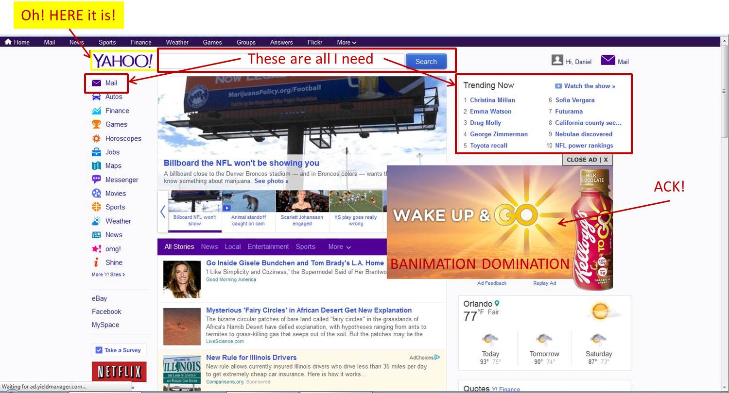
Ah well.  Who really sees it anyways? What, with such a hectic page design?...
Can de-cluttering be next on the agenda, guys?
Banimation Domination!

All the ad revenue in the world isn’t worth the shame of subjecting viewers to distracting ads. Come on, Yahoo! -- you're better than this.
(Banimation: banner ad + animation – thanks to Jeremy for the ever-so-perfect name!).

Tuesday, April 2, 2013

April 1 “Ads” – Foolish or Foolproof?


Move over, Black Friday and Super Bowl Sunday. There’s a new favorite in advertising, and it isn’t just about low-low prices, door busters, or the most creative (and expensive) 30-second spot.

April Fool’s is the day advertisers can really lie.

No foolin’.

It’s when we can put marketing of the normal product mix on hold to have a little fun and advertise things that don’t exist at all.

Brought to you by the internet and Social media.

Ten years ago April Fool’s Day ads weren’t even possible (or at least very economical). Traditional channels would prove too narrow and lack spontaneity. Use one of your über-expensive TV slots and hope people are tuned in? Post your joke on billboards and wait out a 30-day commitment? No thanks.

The web makes voice amplification easy.
If Scope wants to “announce” a new bacon flavored mouth wash, all they have to do is post a video to their YouTube channel, push it to Facebook and Twitter, and wait for brand advocates to spread the word (see their awesome spot below).

But just because we can, doesn’t mean we should.

To Fool or not to Fool…
…THAT is the question. Seriously, what value does it serve?

When done correctly, you’d be a fool NOT to do it.

April Fool’s Day ads enhance brand personality and consumer affinity.

It comes in many flavors (including new flavors). But also, changes in policy, new product launches, and product line extensions.

And as a joke, we’re not bound to deliver on the message, so it affords marketers the opportunity to REALLY let loose and get creative.


When to do it: 30k Feet’s Guideline to Foolproof April Fooling

To mock yourself


Google produced several spots, all touting new features or technologies.

Google Nose, Treasure Maps, the Levity Algorithm, and our favorite, Gmail Blue (just like Gmail, only bluer)


All are produced in Google’s signature style. You know, multiple camera angles that deliver heartfelt testimonials by tech designers, all brought to life on a bed of soft, compassionate elevator music that crescendos to a BIG reveal…

“What does a ghost smell like!? Google NOSE!”

Google KNOWS how to poke fun of itself (and we applaud the humility).

Need to see some more self-deprecating ad-humor? Check out
Groupon’s GrMail – electronic madlibs, it's the iDEAL way to use email! :)

To mess with your competitors


Don’t want to get tagged, caught ‘gramming, or hashtagged? Jump in the suit.


Microsoft
’s “Do Not Tracksuit” is supposed to make the wearer completely invisible. It’s also a nod to the software developer’s latest pitch of differentiation against Google when it comes to “respecting” user privacy.

A video would have been a nice way to really get the message out there – but it is Microsoft’s first April Fool’s. Have to learn to walk before you can run.


To soft-pitch legit features

Honda used April Fool’s Day to “launch” HondaHAIR – the first in-car flowbee hair trimming tool. Conveniently enough, the bogus attachment pairs with the totally legit new HondaVAC, available in the upcoming 2014 Odyssey. 

In its final moments, the commercial bounces back to a shot of the vacuum in action on spilled cereal – now isn’t that brilliant? “It sure is!” –kid in the commercial.

When it matches your personality

If you’re a zany, unconventional brand, it fits the bill. That’s Scope; at least that’s who scope wants to be. They’ve gone through a brand revamp in the last year or so – and this spot should be right up their new target demo’s alley.

5 days, nearly 4 million views. How else would Scope get young people talking about mouthwash? And the ad is produced well and feels authentic. Our fave April Fool’s for sure!


When it’s the exact opposite of your personality

The other side of the coin.

Seriously; tired, stuffy brands that are looking to grab attention might find an April Fool’s prank to be just the trick. Let’s say the Quaker Oats man got retooled as a hipster? You’d pay attention, right? You’d respect the company’s attempt at humor and maybe, if they paired the mock-announcement with a soft product launch, you just might pay the brand a visit next time you’re at the grocery.

Snickers Snickettes, Seamless' Deluxe Delivery, Conan State University, and American Eagle’s Skinny-Skinny (spray on) jeans.

AdWeek
did a great job at gathering all the major 2013 April Fool’s ad spots.

Which are your favorites? Which miss the mark? Let us know! >


Wednesday, March 27, 2013

Forget the Snake; 2013 is the Year of the Goat (at least when it comes to Advertising).


Make no mistake; the real winner of Super Bowl XLVII was Doritos.

Enter: the goat.

And just when we thought advertisers had beaten the animal spokesperson strategy to death! Seriously though, did you think there was anyone left in all the animal kingdom who could feel fresh and new?!

Doritos’ “Goat 4 Sale” spot was a pure genius.

Devoid of any real words, it introduced us to a whole new vernacular; the goat scream.
In case you haven’t seen it (what, do you live under a rock?):
Not only did the 30-second spot go viral, it triggered a tidal wave of social media love for goats everywhere.

Search “Screaming Goat” on YouTube and you’ll find over 194,000 results; compilations of live video from the farm and screams fit to pop songs and Oprah Winfrey.

8 weeks later and we still can’t get enough.

You can imagine our excitement when we first learned that Mountain Dew had released a goat spot.

You wanna see it? You ready? Here it is:
What the…?

The first eight seconds (that’s 26% of the entire campaign) are spent on the guy just trying to get his date to notice the damn thing.

Then 10 seconds of the goat not wanting the Mountain Dew (waitress gets slapped).
5 seconds of the goat wanting the Mountain Dew (waitress gets slapped again).
and 7 seconds of Mountain Dew euphoria, (more slapping) ::end scene::.

To be continued? No thanks. Like the goat during the first half of the commercial, we “don’t want it.”

It's like Mountain Dew is looking over Doritos' shoulder; copying all the wrong answers on the test.

In what ways does MD miss the mark?

No scream.
The scream is what makes the Doritos commercial. It's the big finish that breaks through the monotony of the crunches and grabs you. It elicits laughter. The scream is what we’re all Googling, YouTube-ing, tweeting, re-tweeting and sharing to facebook; why even use a goat if you’re not going to use the scream!?

No depth.
Some loose assemblage of a story would be nice. It’s insane for the sake of being insane …and nothing more. The crazy creative fits the brand’s eccentric personality but the character is crude without being clever and fails to impress.

Did you know the goat is supposed to be a girl? “Felicia” is her name. We’re all about breaking gender roles, but why impart more confusion with a tux and male voice?
It’s no contest.

I guess not all goats are created equal. In the game of goat – Doritos: 1, Mountain Dew: 0.

Friday, February 8, 2013

Things are bright and cheery over at The (new) Vitamin Shoppe


What better time of year for a healthcare/supplements store to debut a new look? Q1 is their Christmas!

Customers are flooding in; resolved to live a better life, combating epidemic colds and flu, or perhaps a combination of both.

I’ve always been a GNC loyalist, so pardon the delay in my taking note, but
 
The Vitamin Shoppe has totally transformed!
An improvement for sure, but given the incumbent, was there ever any doubt?

The previous logo was totally ordinary, which doesn’t pair well with an already terribly generic name.

And it was a name and logo all at once, mounted on a thick, heavy oval of blue and gold. The bloated, italic typography, with its hard edge lines and the useless inclusion of “since 1977” left the mark feeling unnecessarily busy.

Vitamin Shoppe’s new look follows the sweeping trend in clean, simple design.

The Colors

While it retains the heritage colors of blue and gold, it brightens both quite a bit. Increasing yellow’s prominence was a smart move; as it makes the mark feel young, healthy and full of life (and isn’t that why we pop vitamins in the first place?).

…Wait, where else have we seen this color palate?
Did someone have a sale on blue and yellow-gold?
A little too close for comfort, if you ask me. I’d have tweaked the colors a bit more to secure a truly unique identity, (and avoid brand confusion with the Sprawlmart pill aisles).

The Typography

Nothing earth-shattering, thin and simple – but a breath of fresh air! And hey, it does as good a job as any of carrying the word “Shoppe” into this century.

The Shield

Perhaps the most interesting update was the addition of an emblem.

The Vitamin Shoppe’s “V” is bold and impactful. It brings real movement to the brand and is well suited for the hip minimalist approach to product labels, promotional posters and social media avatars. Although not iconic, it strives to be, and will no doubt become sole ambassador of Vitamin Shoppe across the gamut of iOS, windows, and android mobile apps.

Not bad brand evolution.

When it comes to the new look, we give The Vitamin Shoppe a clean bill of health!