
When former Google Exec Marissa Mayer took the helm as CEO at Yahoo! last July, a skeptic Silicon Valley was put on high alert.
13 months of moderate alterations to both corporate and site
services structure are now behind us. On
the highlight reel we have a cease-and-desist on telecommuting, an emboldened
maternity program, and now, the first major brand refresh since (basically) the search engine’s founding
nearly two decades ago (19 years already,
can you believe it?!).
A logo reveal THIS BIG deserves a PARADE!
…Right!?
Wrong.
Still, Yahoo! insisted on building a (purple) mountain out of a mole hill, ‘floating’ 29 different looks by us. One per day, the march of violet wore on so long that even I (the most logo-obsessed marketer you’ll ever know) grew tired of waiting.
Seriously, though – a month-long build up FOR THIS?

Some Parade! Macy’s
Santa knows, if you’re the last one, you have to really SELL IT! Yahoo’s new
logo may as well be one of the clowns that go by at the end collecting horse
poo.
Ok, no need to get so dramatic, Dan.
It’s just if you’re going to build hype – you gotta be prepared to deliver the goods!
Look – the new logo isn’t bad as far as logo evolutions go. The former was starting to feel a bit campy. It recalled the days just before the (first) internet bubble burst, when goofy nerds dreamt up things the rest of us didn’t even know we needed.
This new mark respects the company’s heritage while following the widespread trend towards simple, clean, mobile-friendly lines. And, to connect with my previous points on the former, it better aligns with the state of the web today:
From nerdy, social pariah to hipster-cool intellectual, the tech industry has transformed.
Today’s brand is mature, smart and sophisticated; bold and cutting edge (at least by comparison). And it possesses some well thought-out subtleties (i.e. no straight lines) and nuances (the varied sizing of the ‘o’s pay tribute to the brands signature ‘yodel’).
Changing of the royal (purple) guard.
Perhaps the biggest change is the new variety of violet. While it feels more grown up, I can’t shake the notion its better suited behind the makeup counter at Sephora or in the feminine hygiene aisle at Target. It’s just too dainty to represent a juggernaut internet company.
Evolution not a Revolution
I reiterate, new Yahoo! did NOT deserve a parade.
Seriously, if you take a look at the 29 teasers that came before it, we pretty much had it day one (OK, and maybe a little day 10).

Ah well. Who really sees it anyways? What, with such a hectic page design?...
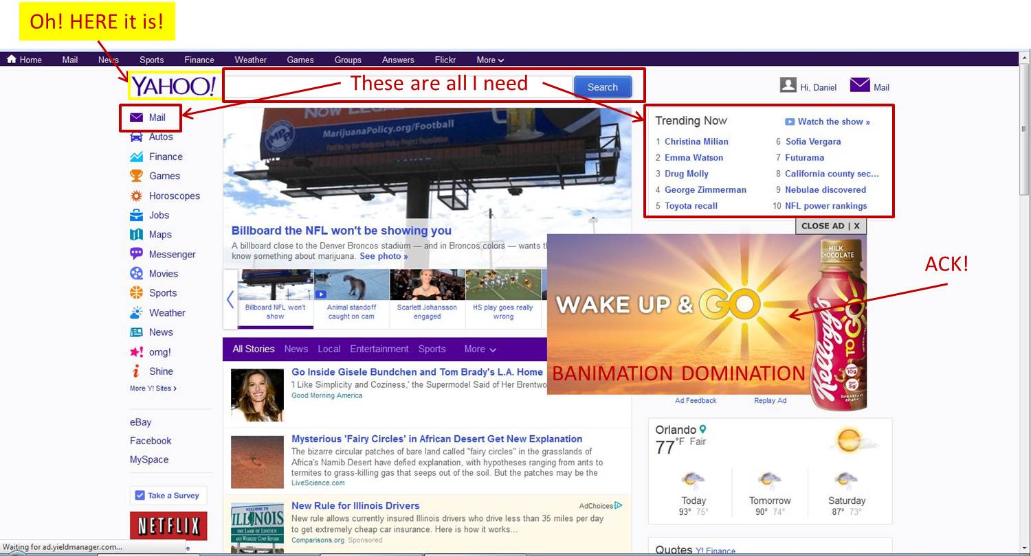 |
| Can de-cluttering be next on the agenda, guys? |
All the ad revenue in the world isn’t worth the shame of subjecting viewers to distracting ads. Come on, Yahoo! -- you're better than this. (Banimation: banner ad + animation – thanks to Jeremy for the ever-so-perfect name!).
No comments:
Post a Comment