Showing posts with label Brand. Show all posts

Thursday, February 18, 2016

Mobile Wars: Who Has the Balls?

Remember where you were just a kid at the amusement park jumping into the big pit of musty plastic balls? Well, now you can relive that same fun-for-a-few-minutes-than-gross sensation during most any primetime commercial break, courtesy of the mobile phone carrier wars reaching a new height in laziness.

It started out well enough.

There’s no doubt Verizon’s “A better network as explained by ______” series was devised to tackle the age-old challenge of demonstrating superiority in an otherwise homogenous services industry.

Where ______ has been:
  • a door
  • an hourglass
  • an abnormally large basketball hoop
  • an expensive egg
  • a high school 'it' couple (the BEST, IMO)
  • Star Wars (...wait, what? WHY?!)

All were called upon to help make tangible the argued benefits of the Verizon network.

And then they got the balls…


Simple enough, right? The demonstration is easy to follow; the message is clear, but also, a first in the campaign to illustrate the shortcomings of rivals by comparison. Who’s gonna stand for that?

And so Sprint got the balls…


And then T-Mobile got the balls…

Not one, but TWO spots! (ONE during the Super Bowl, guest starring Steve Harvey!)


Sorry, AT&T doesn’t have any.

…At least at the time of publishing, but who wants blue balls anyways!? (Wink face)


Here’s Why it Doesn’t Work.

Look, the spot fits as part of the overall “Better Network as Explained by …” series. It’s a simple premise that works as part of a whole, a single chapter in a larger story.

But as the rebuttals by rivals start to stack up, the impact of each gets diluted.

Who can remember which company is claiming what based on which independent study of what sample pool, etc. anyways?!

Don’t hold us captive to a public splitting of hairs within the construct of a competitor’s campaign!

Advertising budgets are small. Why blow them on direct responses to your category leader? Your negation of Verizon’s claims should ENTERTAIN us! (Ok, the T-Mobile spot with Steve Harvey comes close. It’s self-deprecating and timely, but our minds shift to the Miss Universe flub and we forget why you’re so great).

Fine, if you simply must “set the record straight”, do it in your own style!

Kick Verizon IN the balls and cut a different comparison that feels on brand!

When you respond direct and use the same format, you are letting Verizon set the terms and parameters of the conversation. Mock the simplicity of their latest series, question their intentions behind “simplifying” mobile.

You’re all already advertising everywhere, at least look different and tell different stories.


Friday, May 23, 2014

Social Media Dos and Don’ts in the Face of a Brand Mishap


I’ve been thinking a lot about the evolution of social media as a method for brand communication. Specifically, how it should react in the event of a PR nightmare.

While more traditional advertising channels are rigid – TV/radio pre-recorded, print/billboard, pre-printed and placed – digital can be real-time and responsive.

And with that, comes the HUGE responsibility to do so.

Social can’t be all carefully crafted and canned like its traditional channel counterparts. Its fundamental premise begs of users to be quick-witted and casual, to provide an on-going, authentic dialogue that takes into account real-time global news and perceptions on brand.

Case in Point: Malaysia Airlines.

As a recent example, let’s consider how Malaysia Airlines (MAS) used social media before, during, and after the loss of MA370.

Before MA370 ever left Kuala Lumpur
All systems go. MAS used social media as you’d expect any airline to. They played up back-banter with happy fliers while trying to quell hot-headed tweets re: lost baggage and cancelled flights. They shared radiant photos from exotic flight destinations and high-impact, brand-affirming stories of engaged employees and loyal travelers.

Finding a new voice while trying to find a plane
A quick change in altitude. When Beijing-bound Flight 370 vanished without a trace on March 8th, the airline’s social media profiles immediately swapped full-color logos and image-rich cover photos for solid bands of gray. The feel-good stories ceased with a clear, deliberate shift in intention from promotion to that of reporting facts and clarifying rumor.

Returning to protocol post tragedy (the tricky part)
Mayday-mayday!! MA370 is (still) a HUGE global story of human interest! 239 people are missing without a trace and presumed dead. What’s Malaysia Air doing? Asking its twitter audience to choose between a sunrise and sunset.
Wait. Those aren’t the same waters you lost a plane in earlier this year, right?
They’re also trying to launch and promote hashtags like #MHJourney and #MHMoments (where ‘MH’ is their IATA airline designator). What current ‘journey’ or ‘moment’ with MAS does NOT remind you of the missing jetliner?

Here’s a smattering of recent posts. You don’t have to be a professional comic to come up with dark, clever retorts to any one of these:
I’m glad SOMEONE had a smooth landing! #whereisMAS370
What QUESTIONS do you think #MA370 passengers should have thought to ask?! #BESTjourney How about the South Indian Ocean? “Memorable experiences” flying #MAS, that’s for sure!

Look, I’m a stone-cold Marketer.

I get why MAS would want to put this tragedy behind them and get back to the glamorous world of shameless self-promotion.

At first glance, it’s just disrespectful and in poor taste.

But beyond that, it’s also confusing. You want to ask, was marketing not clued in!? Do they not know MAS lost a member of its fleet a few months ago!?

It’s just naïve to be so brazen with the promotions in the face of a very recent, very clear product fail.

There are no definite rules here.

No algorithms to follow, plotting size of tragedy with length of marketing moratorium. We’re all learning as we go, praying we never have to make the call ourselves.

Still, here are a few down-and-dirty suggestions to start.

Draw a Clear Line

Communicate your intention to shift gears before you actually do it.

No one likes a blind-side. Hire a passionate writer to craft a rich letter or produce a heart-felt YouTube video and broadcast a final apology. One that honors the past, owns fault, and recommits to your roots with a promise to survive and thrive. Don’t forget to test for goose bumps.

Start Small

Before you decide to flip back on the promotional power grid, maybe consider first a feel around in the dark? Listen to social media. What’s the buzz and prevailing sentiment regarding your brand?

If it’s still hot with rage, delay.

And Build

When you finally do return to your “regularly scheduled program,” cut the frequency and soften the tone. Social media is rich with human emotion and your brand voice should come across the same; moving on but irrevocably changed by the event.

And whatever you do,
Don’t pitch softballs to all those cynical twitter super users and haters!!

Challenge every tweet. Comb through those 140 characters again and again, pressure testing for even the slightest chance someone might misconstrue intention or grab hold of a double-entendre and run with it at your expense. People love to kick ya when you’re down. It’s a pandemic and everyone wants their jab to go viral.

Social media in the face of brand implosion.
Can you think of any other examples of the good, the bad, or the ugly?

Have a great long weekend, everyone. :)
-DS

Friday, January 17, 2014

Cadillac gained weight over Christmas…


…Like, a lot.

While we were all too busy wishing one another ‘Happy Honda Days’ and ensuring it was a ‘December to Remember’, no one remembered to tell Cadillac to go easy on the sugared cookies.

And now, this:
There’s more to love at Cadillac!
…Or not. Yeah, DEFINITELY NOT.

The new look scraps the laurel wreath, making room for the adjusted (read: inflated engorged) iteration of the signature crest.

Developers maintain the new mark matches the brand’s forward-thinking mantra “lower, longer, leaner” – a promise embodied in the brand’s current and near-future automotive designs.  Is it just me, or does the Cadillac fleet seem to place emphasis on the exact opposite? Tall, slim, sharp featured headlamps and taillights; emphasizing narrow, vertical height -- it's a style in glaring contrast with the now horizontally-focused brand mark.

Sorry, but I’m not buying it.

While I commend the brand’s refresh for adopting the less-is-more trend in sharp, streamlined design, I can’t get behind the increase in total surface area and disproportionate balance top/bottom, left-to-right.

It looks like some graphic design intern didn’t know they were supposed to hold shift when they tugged on the corner.

It’s both clunky and garish and looks extremely down market for a brand intended to compete against foreign luxury nameplates.

Size matters.

And when it comes to applying brand to car, one size does NOT fit all.

Mercedez-Benz and Volvo, YES – bigger does seem better.
Cadillac, ABSOLUTELY NOT.
The new look is slated to hit the streets this summer with the delivery of the 2015 ATS Coupe. Let’s hope it gets some toning time in at the gym before then, ‘cuz this brand is by NO MEANS beach-ready.

Happy New Year!
-DS :)

Thursday, September 12, 2013

Kmart Breaks the Seal on Christmas 2013 Advertising


…and just like that, the love affair with Kmart advertising ended.

The retail bottom-feeder has recently enjoyed a run of accolades over its refreshing commercial spots. <<Quick Rewind: First it was ‘Ship my Pants’ and ‘Big-Gas Discounts’ – then a string of Back-to-School spots featuring playground rhymes and crimes of retro 90s fame (The “Yo-Mama” dis spots being my personal favorite).
First to climb up the 2013 tree!
But with over 100 days till Christmas (that’s right, the countdown still beats in the TRIPLE digits) the same army of “Don’t rush the season!” scrooges that usually have to wait until early-October to rise up are absolutely LOSING IT!

Here’s the spot:

Cool it, perma-bah humbugs.

I can’t imagine the piles of coal Santa must have left in your childhood stockings; y’all are NEVER happy to see the holidays! The spot doesn’t reek of holiday cheer – just a few faint bells and a scantily clad cookie. It’s not an overrun exposé of buy, BUY, BUY! but a subtler, non-specific “calm before the storm” reminder to start planning now so that you (and your wallet) aren’t over extended closer to year-end.

And, you gotta understand Kmart’s position.

The retailer has been playing second fiddle to Target and Walmart for far too long (wait – that analogy doesn’t even begin to describe the magnitude of the situation… more like trying to play a microscopic fiddle without a bow and the fiddle has been stepped on a few times). Now, for the first time in years ever people are actually taking notice of their ads, they’ve got to make the first appeal to holiday shoppers; opportunity knocks!

According to the National Retail Federation (NRF), 12% of consumers begin their holiday shopping before September, 6% during and another 20% kick it off in October.

And while the stock market continues to surge, consumers are still wary from a frugal 2009/2010.

Getting out in front of the others with a campaign that reminds shoppers of expanded layaway promotions isn’t just smart; it’s k(s)mart!

…No? I’ve used that corny play on words too many times before?
OK, it’s brilliant!

While Kmart’s ad sets a new high-watermark for “Christmas Creep” – they’re expanding the retailer role in providing joy under the tree. Kmart doesn’t just want to be the place you run for door-busting specials, they want to work with you and help budget throughout the entire holiday shopping process.

Great move, guys. (The spot could have been just a bit funnier, though. The cookie’s creep factor is at 3 – it needs to be at like a 7-8 (aka Burger King ‘King’-creepy)). :P

Thursday, September 5, 2013

29 hopefuls and one new Yahoo!


When former Google Exec Marissa Mayer took the helm as CEO at Yahoo! last July, a skeptic Silicon Valley was put on high alert.

13 months of moderate alterations to both corporate and site services structure are now behind us.  On the highlight reel we have a cease-and-desist on telecommuting, an emboldened maternity program, and now, the first major brand refresh since (basically) the search engine’s founding nearly two decades ago (19 years already, can you believe it?!).

A logo reveal THIS BIG deserves a PARADE!

…Right!?
Wrong.

Still, Yahoo! insisted on building a (purple) mountain out of a mole hill, ‘floating’ 29 different looks by us.  One per day, the march of violet wore on so long that even I (the most logo-obsessed marketer you’ll ever know) grew tired of waiting.

Seriously, though – a month-long build up FOR THIS?
Some Parade! Macy’s Santa knows, if you’re the last one, you have to really SELL IT! Yahoo’s new logo may as well be one of the clowns that go by at the end collecting horse poo.

Ok, no need to get so dramatic, Dan.
It’s just if you’re going to build hype – you gotta be prepared to deliver the goods!

Look – the new logo isn’t bad as far as logo evolutions go. The former was starting to feel a bit campy.  It recalled the days just before the (first) internet bubble burst, when goofy nerds dreamt up things the rest of us didn’t even know we needed.  

This new mark respects the company’s heritage while following the widespread trend towards simple, clean, mobile-friendly lines.  And, to connect with my previous points on the former, it better aligns with the state of the web today:

From nerdy, social pariah to hipster-cool intellectual, the tech industry has transformed.

Today’s brand is mature, smart and sophisticated; bold and cutting edge (at least by comparison). And it possesses some well thought-out subtleties (i.e. no straight lines) and nuances (the varied sizing of the ‘o’s pay tribute to the brands signature ‘yodel’).

Changing of the royal (purple) guard.

Perhaps the biggest change is the new variety of violet. While it feels more grown up, I can’t shake the notion its better suited behind the makeup counter at Sephora or in the feminine hygiene aisle at Target. It’s just too dainty to represent a juggernaut internet company.

Evolution not a Revolution

I reiterate, new Yahoo! did NOT deserve a parade.

Seriously, if you take a look at the 29 teasers that came before it, we pretty much had it day one (OK, and maybe a little day 10).

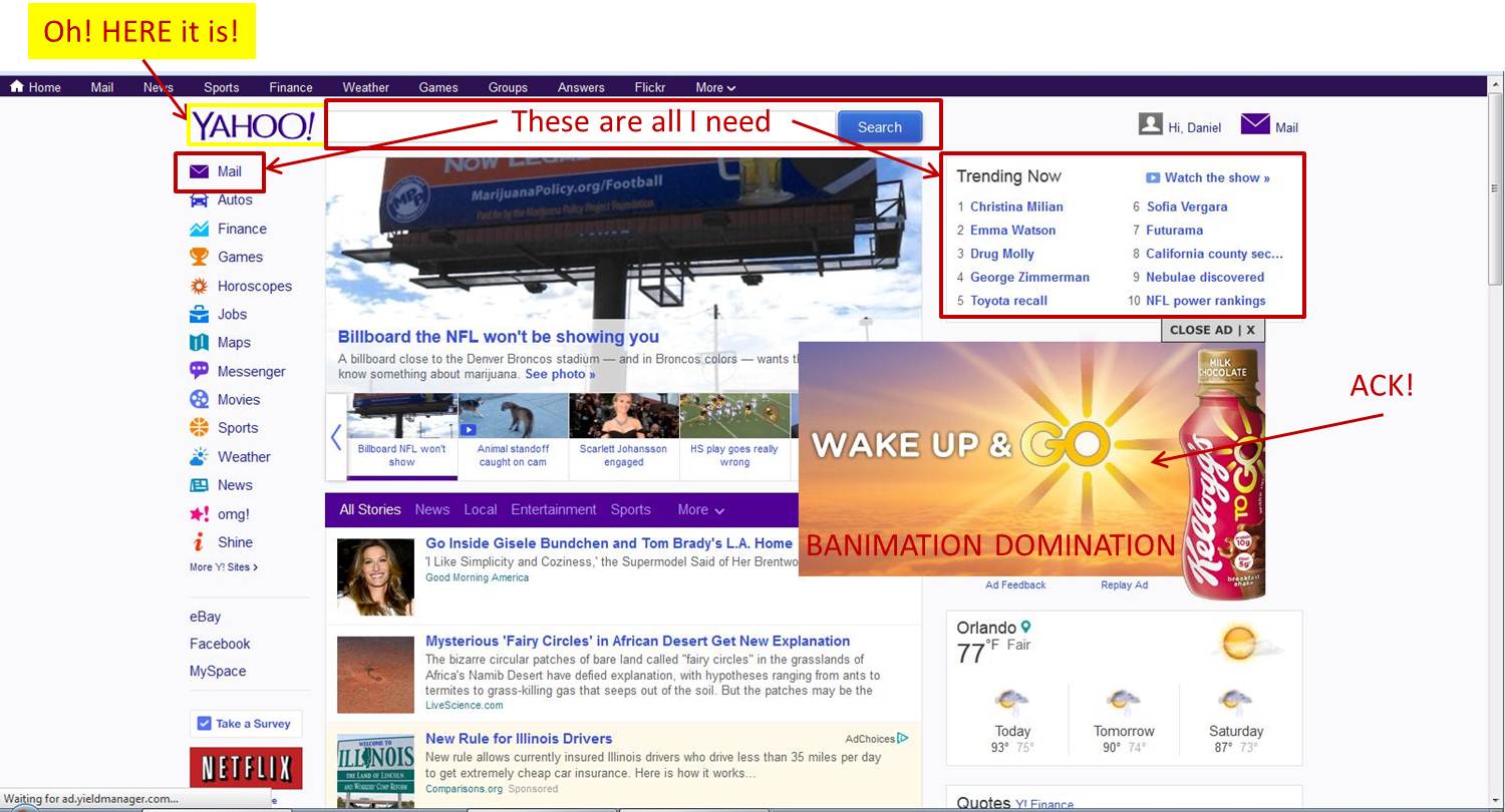
Ah well.  Who really sees it anyways? What, with such a hectic page design?...
Can de-cluttering be next on the agenda, guys?
Banimation Domination!

All the ad revenue in the world isn’t worth the shame of subjecting viewers to distracting ads. Come on, Yahoo! -- you're better than this.
(Banimation: banner ad + animation – thanks to Jeremy for the ever-so-perfect name!).

Friday, July 5, 2013

Facelift Friday: 'Ernst & Young' now just 'EY'

My, it’s been awhile since we’ve reviewed a logo transformation!

What can we say? It’s been a slow summer.  A slight curve here, a flip-flop/color swap there; only modest brand revisions.

Everyone’s been playing it safe.

…Until now.

EY. Pronounced ‘EH’?! (read: huh?)

Big 4 Beaming?

Just before we broke for the 4th, Ernst & Young unveiled a radical new brand design. Aimed at sophisticated, bold simplicity, the first impression just fails to connect. What do you think?
Building a better working world?! How about you build a better working logo first?

While we agree with the firm’s “out with the old” intentions, we’re not sold on the “in with the new” results.

Sure, the previous look felt a bit cluttered and a lot stodgy. It was where dad put in thirty-five years, not where daughter/son got a career started. The interlocking EY mark, albeit clever, felt outdated, like some retro-modern, mega-60s trip.

But the new is a clear attempt to maintain harmony between the “E” and “Y” executed in the most unimaginable and unbelievably dull ways possible.  Referred to “in the biz” as both “E and Y” and “E-Y” interchangeably, dropping the ampersand makes a clear distinction of the brand’s preference moving forward. The new mark follows form in the latest trend of “less is more” design.
We’re sure they have some deeply poetic rationale behind “the beam.”

What and why?

A beam of light – everyone wants shown through the dark! EY’s beam is focus and guidance; it’s your tool to navigate the choppy, unknown seas of (whatever) business (you’re in). It’s bright and energetic. It’s sloping up, just like EY clients’ margins and profits! Won’t you join them?! 

Suffice to say, it’s a simple addition introduced to simulate uniqueness. Partnered with the right copy, it will deliver just the right amount of “warm fuzzies” you’ve come to expect from a global professional services firm (read: very little).  

3 down, 4 to go.

An industry changed! With Enron’s collapse, the rise of Sarbanes–Oxley, and fall of Arthur Anderson in 2001, the Big 5 became the Big 4 and a critical line was drawn in the sand.

Looking to abandon any image associated with life before industry meltdown, three have now undergone major brand overhauls.
With simple, sans-serif typeface and the introduction of otherwise generic shape and color, each hopes to better relate in the new, global marketplace and digital age.

It’s your move, KPMG!

Tuesday, June 18, 2013

If Kraft wants us to "Get Zesty," they'll have to do better than this.


Have you met this guy?
@TheZestyGuy

Kraft is just one of the latest to join the already crowded bandwagon of companies looking to reinvigorate stale brands with nonsensical characters that toe a line between creepy and cute.

The Evolution of the Always Silly (Sometimes Sexy) Front Man; 3 Simple Examples.

Sample One – Fabio for “I Can’t Believe it’s Not Butter”

Fabio made us (read: primarily the female population) believe ‘it’s not butter’ during his mid-nineties stint as the butter substitute’s front man. Acquired by Unilever in the late 1980s, “I can’t believe” rose to fame and an eventual lead in the category on the broad, bronze shoulders of the Italian supermodel.

Silly: Yes, in ways that would make a soccer mom blush. | Sexy: Absolutely; but in a corny fantasy sort of way.

Sample Two – The King for “Burger King”

A decade later, and Burger King’s King was an omnipresent, (omnisilent) front man hired to woo a different demographic; men. Lingering and lost without a voice somewhere between McDonald’s and Wendy’s, it was the King’s aloof, almost stalking nature that hooked audiences…provided one could shake the fear of finding him back home waiting with a knife.

Silly: Yes, in a creepy, lock your doors sort of way | Sexy: Not quite (unless you’re into clowns).

Sample Three – Isaiah Mustafa for “Old Spice”

And in the last few years, we’ve got to know Isaiah Mustafa; “The Man Your Man Could Smell Like.” Seriously, Old Spice owes its second chance at life to Isaiah; the product was on life support at P&G. The spots’ are a living, breathing game of advertising Mousetrap and Isaiah’s the marble. Scene by scene, he soars through a non-sequential maze of slapstick comedy that leaves your eyes satisfied and wanting another go-round.

Silly: Yes, product attributes and benefits are laced with hyperbole but no one seems to care. | Sexy: Yes; but subtle and not over-reaching.

It’s time to Get Zesty.

And now, Kraft’s attempt to make salad dressing sexy again (or would it be for the first time)?
Either way, something’s missing. It just doesn’t feel right.

Too sexy? –
Maybe it’s that the actor is too good looking to play a light hearted goof?

Sexy doesn’t pair well with corny. While Isaiah is certainly attractive, he’s got rounded edges that make him more realistic and humble. That’s the kind of build we’re comfortable receiving slap-stick comedy from. It’s like Kraft’s Zesty Guy wants to twist us a balloon animal after just stepping off a swimsuit runway walk.  We can’t shift gears that quickly.

Weak setup?
– Slicing a pepper with the simple draw of a knife; the dissolve of a shirt with the quick stoking of a sauté fire. Maybe the nonsensical elements are just too boring?

Seriously, if you’re going to employ non-realistic story-lines, why stay so tame? Conjure up some elaborate exposé of how the Zesty Dressing’s ingredients were found/harvested/brought together. Have our Zesty hero walk/run/crawl/climb us through some visually stimulating, faster-paced story board.

Poor Delivery?
The flat effect of Zesty’s voice sucks any life out of the lines.

With Fabio, you had a distinct accent; with Isaiah, you have a highly articulate, booming voice. Kraft’s Zesty Guy couldn’t have a more indistinct method of speech. It’s kinda innocent and bashful, kinda muffled and weak.

Maybe it’s a mixture of all three.   

Am I the only one not feeling it?

Maybe I’m in the minority of those finding the character/sequence impossible to connect with. After all, he’s pretty popular on social media (facebook, YouTube, twitter + virtual postcard sharing).

What do you think of Kraft’s Zesty Guy?

PS:
(a bonus that surfaced only after I had assembled this post) One demo he’s not resonating with is One Million Moms. The ultra-conservative group is outraged at the blatant sexuality in the dressing's latest creative:
Seriously though, there's some creative photoshopping on that table cloth...