Spring Cleaning for
Windows
We were going to ignore this one, but it’s been all over the
tech forums the past couple of weeks and we couldn’t resist weighing in.
The highly anticipated (and
much delayed) release of Windows 8 is just around the corner. The next
iteration of Microsoft’s marquee OS has completely reimagined PC computing.
Tasked with merging desktop, tablet and mobile interfaces under one central UI,
Windows 8 is bound to create more headaches than brand advocates – at least at
the onset.
Still, you can’t reinvent the wheel and expect it to sell wrapped
in the same old packaging.
And so, we continue our Facelift | Faceoff series with a
review of the new logo Microsoft has identified to carry Windows forward.
Before the facelift:
If you are part of corporate America, this image is already
ingrained in your brain. Since the release of Windows 95, Microsoft has used varying
iterations of its “flying window.”
While minor tweaks in type face and subtle nuances in color
tones are seen over the years, the red, green, blue and yellow quadrants have
remained fixed regardless of version (and
we have no doubt some poetic and overly-verbose prose exists which deconstructs
the rationale behind each).
Gizmodo’s Windows Logo
Timeline sums it up best:
So what’s the next logical step in the evolution of the
Flying Window?
After surgery:
Not this.
The new logo follows a more recent trend in clean and crisp design
(essential in maintaining brand integrity
across both traditional/virtual channels). Text over graphics, Windows 8 occupies a greater stretch of
horizontal space while reducing the flying window to a symbolic version of its
former self. Perhaps the greatest change is the decision to banish the
multi-color in favor of a new, almost neon-pastel blue.
30k Ft Weighs In:
What’s good:
The logo does feel clean and simple, restoring our hope that
the OS will follow suit from a user perspective.
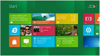
If you’ve seen screen shots of Windows 8 beta tests, you can
agree that the logo’s “window” looks a lot like the screen icons/apps that
dominate the Windows 8 user experience.
And so, rather than reconfiguring the existing, flying
window – a symbol that has no applicability or function within the actual OS –
Microsoft opted to create a new icon that actually mimics the product’s
functionality – brilliant.
What’s not-so-good:
We’re with the majority – is that a Scandinavian country’s
flag in front of the text treatment? The “window” feels so abstract when compared
against Windows 7 that we don’t immediately get it.
What’s wrong with keeping the legacy red, green, blue,
yellow and intact on the quadrants? It’s a compromise that would retain all
that’s good and not feel as foreign to users already weary at the thought of
learning a new system.
Which do you prefer?


I had no idea they were even coming out with new software! I'm in such a healthcare bubble :( Anyway, the new logo looks like it came out of a 10th grade graphic design project. So dull. No dimension whatsoever. Gross.
ReplyDeleteIt seems a lot of companies are gravitating towards flat, clean lines. Makes maintaining the logo's integrity on small real estate (mobile devises, landing pages, etc.) easier. Still, I agree. When the world already perceives you as boring, you need not add fuel to the fire with a logo that matches perception.
ReplyDelete